2014 was a year of remarkable transformation for this online social platform (name hidden for privacy). I came on board during a complete reimagining of the company’s place in the market to redefine the user and their needs to then accordingly redesign the product.
Project Overview
In 2013 – 2014, I worked with the team of a social network digital product to help refocus and design their new strategy & online platform.
Its design was beginning to age, and the content had slowly become fragmented and unorganised as things were added, edited, and rearranged over time. The user experience had never been considered and the website desperately needed a fresh start which is why I came onboard.
The aim was to bring the world’s leading mental health and human behaviour experts together through a social platform that offered innovative ways to connect them with both practitioners and patients. The new design had to work seamlessly and aimed to showcase international industry events, courses and professional services.
My Role
As the Head User Experience and User Interface Designer, I worked with a team of software engineers, developers and business analysts and was responsible for the research, interaction design, visual design and rebranding.
I worked closely with both customers and stakeholders to ensure that we delivered exactly what was needed whilst not compromising on business goals & objectives.
Old website before I started working on it.
Challenge
Before I started, the company was challenged by:
-
Limited understanding of the website as a whole entity
-
No holistic approach
-
Lack of structured processes for key deliverables
-
Confused / fragmented team
-
Company goals not aligning with consumer needs
-
Mixed messaging and communication complications within the company
-
Underestimating the value of user research
Naturally, this meant the site had significant challenges as well, such as:
-
Being ‘user unfriendly’
-
Lacking consistency
-
Navigation difficulties
-
Convoluted branding strategy
-
Overall aesthetics
-
Disappointing analytics results
-
Little to no ROI
Why are we building this?
The organisation knew they needed a new site, but it wasn’t clear on exactly why, or specifically for whom.
Were we building this for practitioners? Members of the public? Patients and their families? Experts? Industry professionals? All of the above? We needed to unpack these critical questions to inform the early planning stages of the new site.
We knew that an important goal for the website was to create a reputable and reliable platform for sourcing professional answers on issues of mental health. Therefore, we concluded that prospective patients (and their families) would top our list of target users and largely determine the kind of experience we needed to create.
Process
My job therefore was to bridge the gap between the product and end users by directing the whole production process towards a human-centered design approach.
With both the company and website needing clarity, I used Design Thinking and introduced Agile UX methodologies to unify and better organise our team so that we were more responsive and flexible to consumer needs.
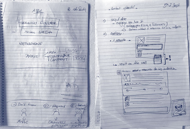
Info Gathering
I reviewed the old site to determine what the company was looking for in a new one. I got together with the team to discuss all things about the company; its past, its present and its possible futures. After gaining a valuable understanding of it (the goals of the project, the needs of the users, their values, and their limitations) I got down to business. I spent some time discussing possible personas, user stories and how they’ll interact with the new site. I finished up by mapping out some early user workflows and wireframes.
Early on, the assumption was that users would be reliant on their newsfeed like they are on Facebook, but comprehensive usability testing about what users needed from this particular social platform confirmed that this wasn’t the case. It became clear that practitioners were mainly looking for information such as upcoming courses and PubMed articles, and patients were there for information or advice about a particular condition.
By starting to understand our user needs we were rediscovering where the business goals and user goals were intersecting. It involved a lengthy process of recognising what to cull and what to keep as we learnt that seemingly key features (like a marketplace on the old site) were no longer necessary for the new one.
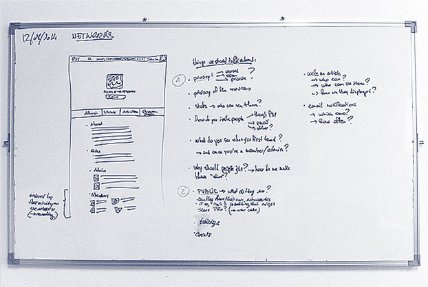
Sometimes the whiteboard is my best friend …
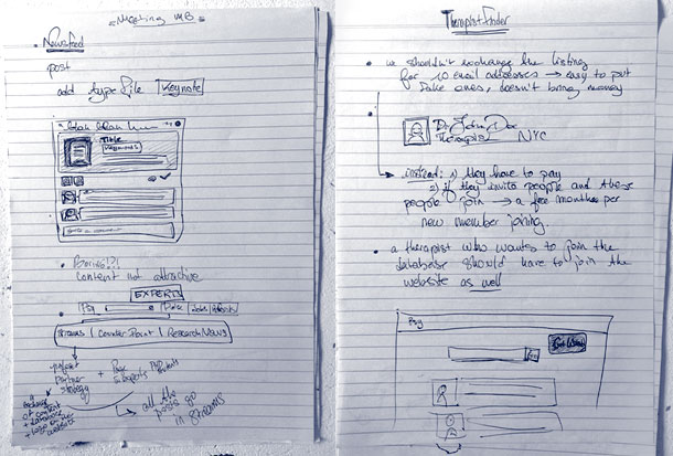
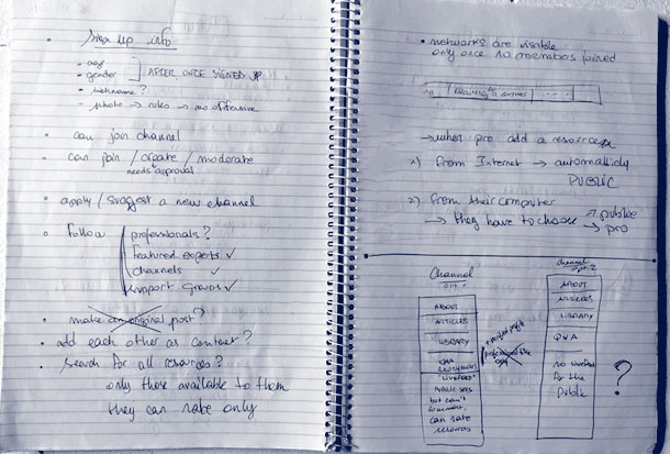
… other times it is my notebook.
Content
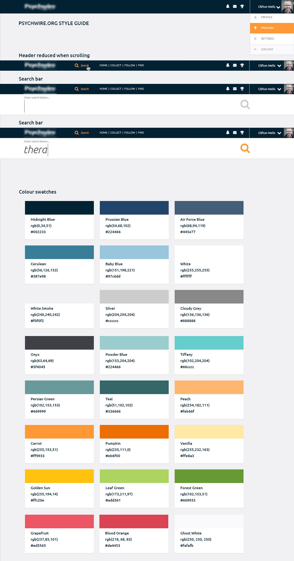
An essential aspect of this project was the information architecture. The old site had tons of content, and as mentioned above, it was fragmented and unorganised. There was plenty of new content to include as well. Sifting through and categorising it all in a way that would make sense to the target audience was a task.

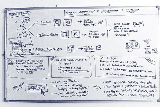
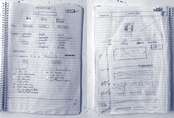
Information Architecture.
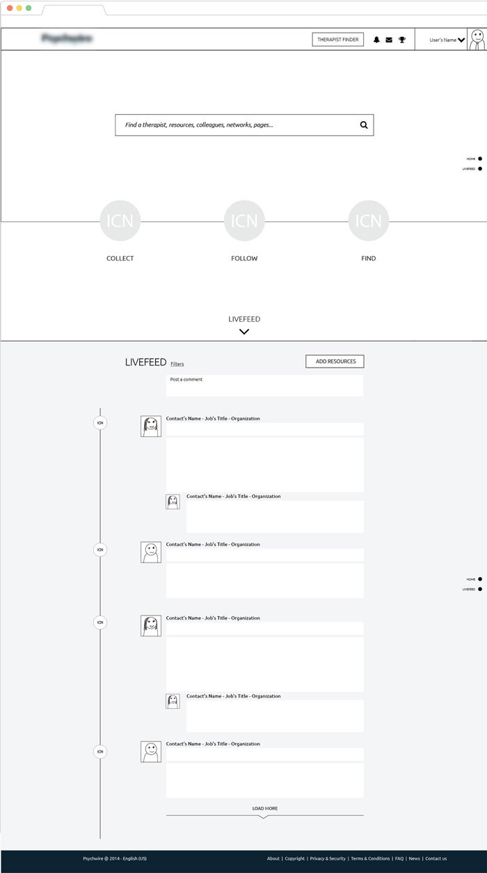


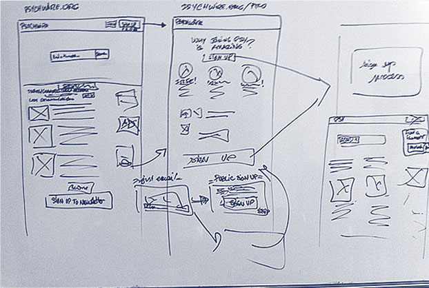
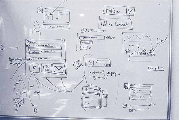
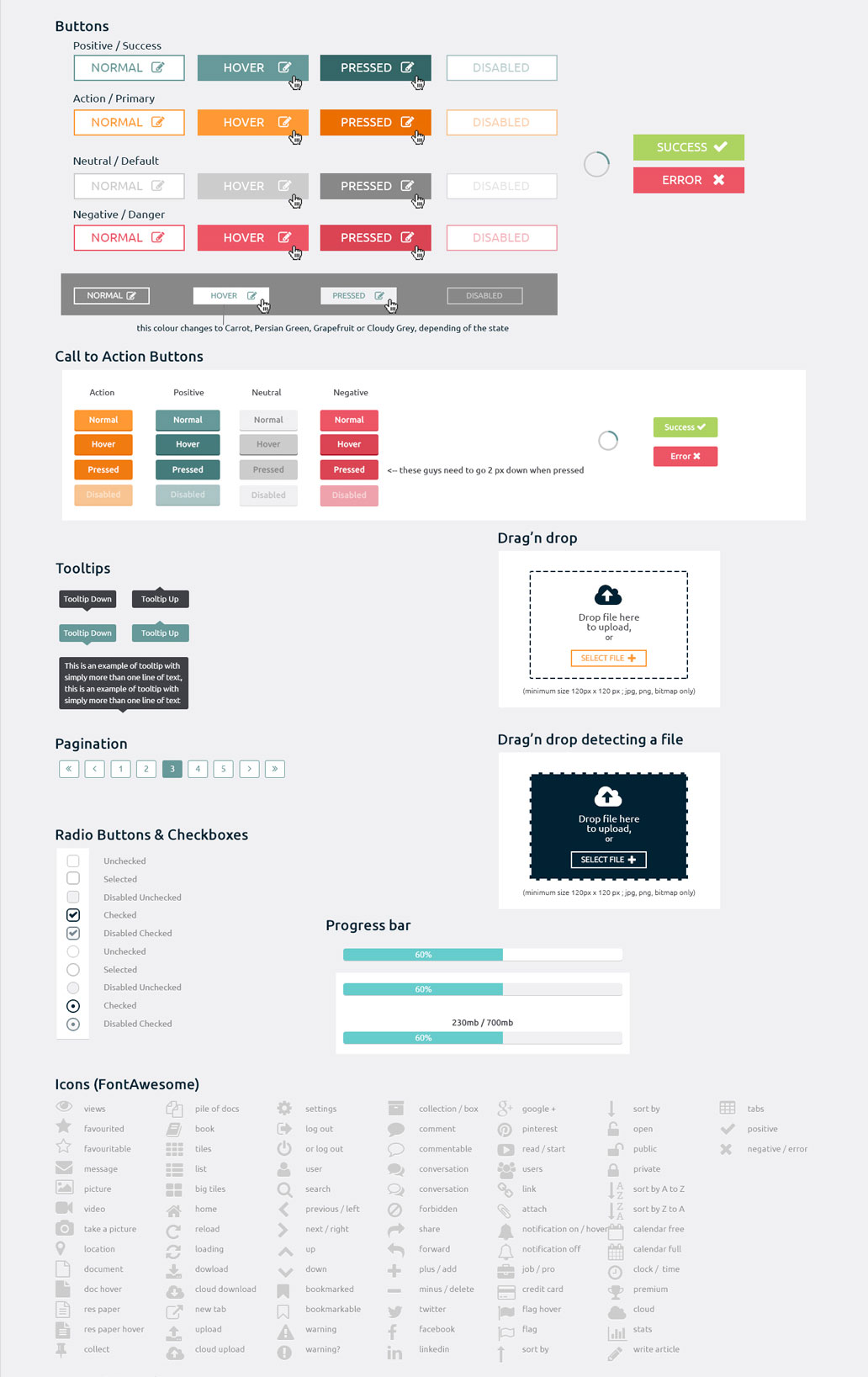
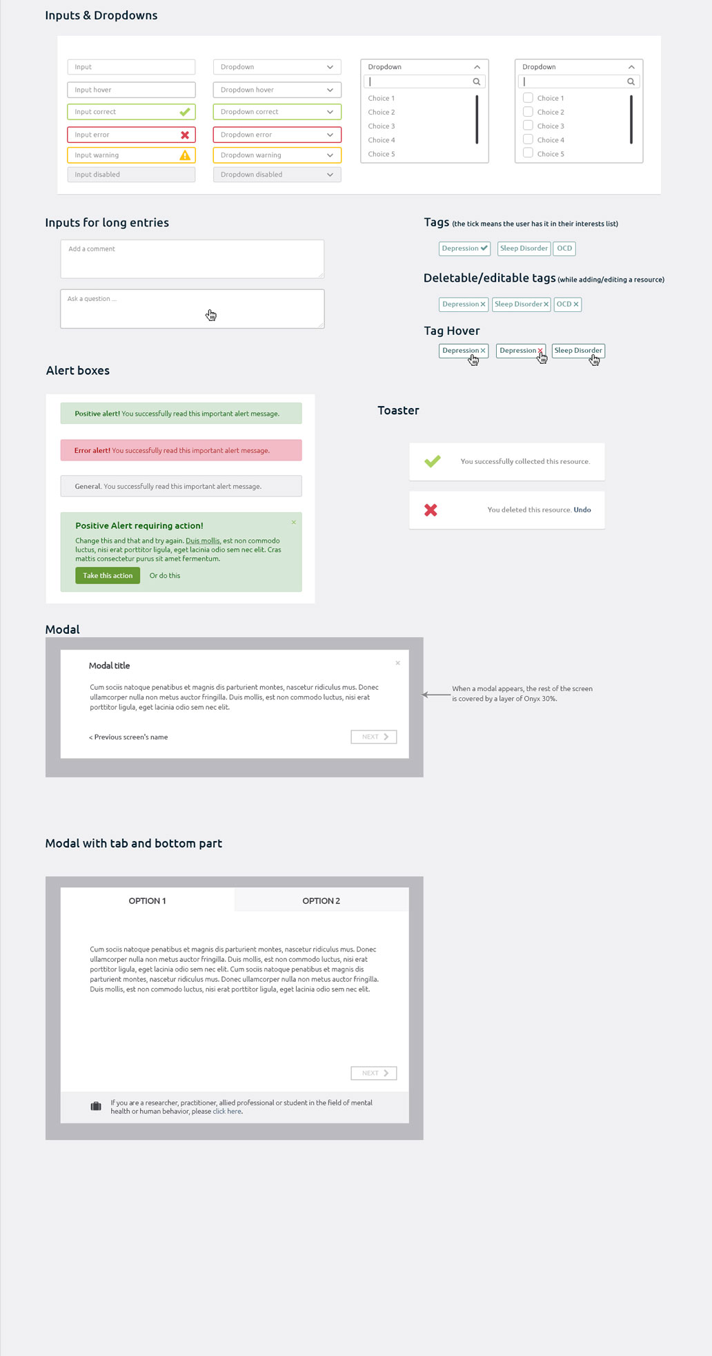
Wireframes (click for bigger pictures).
Prototypes & Tests
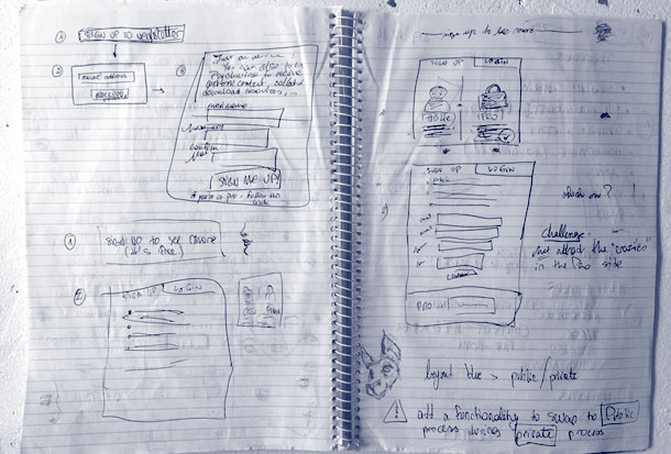
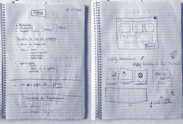
From there, I shot straight into prototyping the new layouts. I started low-fi with simple wireframe prototype and iterated on both the workflow and the content of each page.
The Design
Once I had defined the business objectives, identified the core user (personas/psychographics etc), performed sufficient user research, completed sketches, ideation, wireframing, mockups, prototypes, and usability-testing, I worked to refine the page layouts and the visual design.
Emotional design was prevalent in my visual choices. The idea was to create an interface that connects with the users’ emotions in a positive way, and try to maintain it throughout their journey, paving the way to a competitive advantage and ROI.
I designed the interface as a safe and calming place for patients and practitioners to share their experiences and resources.
The Result
Complete website UX/UI strategy and design including but not limited to:
- Landing page
- Homepage
- About page (+ editing screen)
- Sign up process for the public + one for the professionals
- Livefeed
- Content uploader
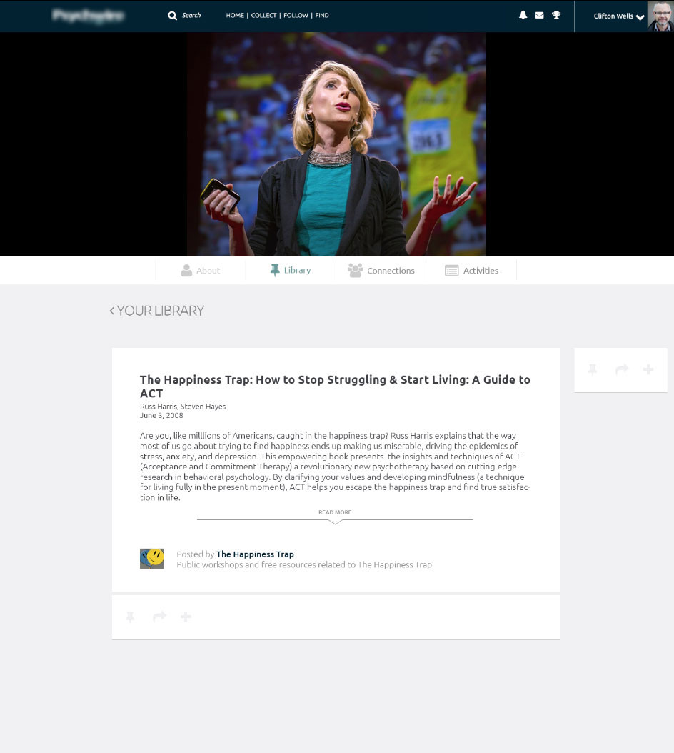
- Library
- Contacts page
- Event page (+ editing screen) + feed + directory
- Message system
- Notification system
- Settings
- Premium version
- Landing page
- Homepage
- About page (+ editing screen)
- Sign up process for the public + one for the professionals
- Livefeed
- Content uploader
- Library
- Contacts page
- Event page (+ editing screen) + feed + directory
- Message system
- Notification system
- Settings
- Premium version
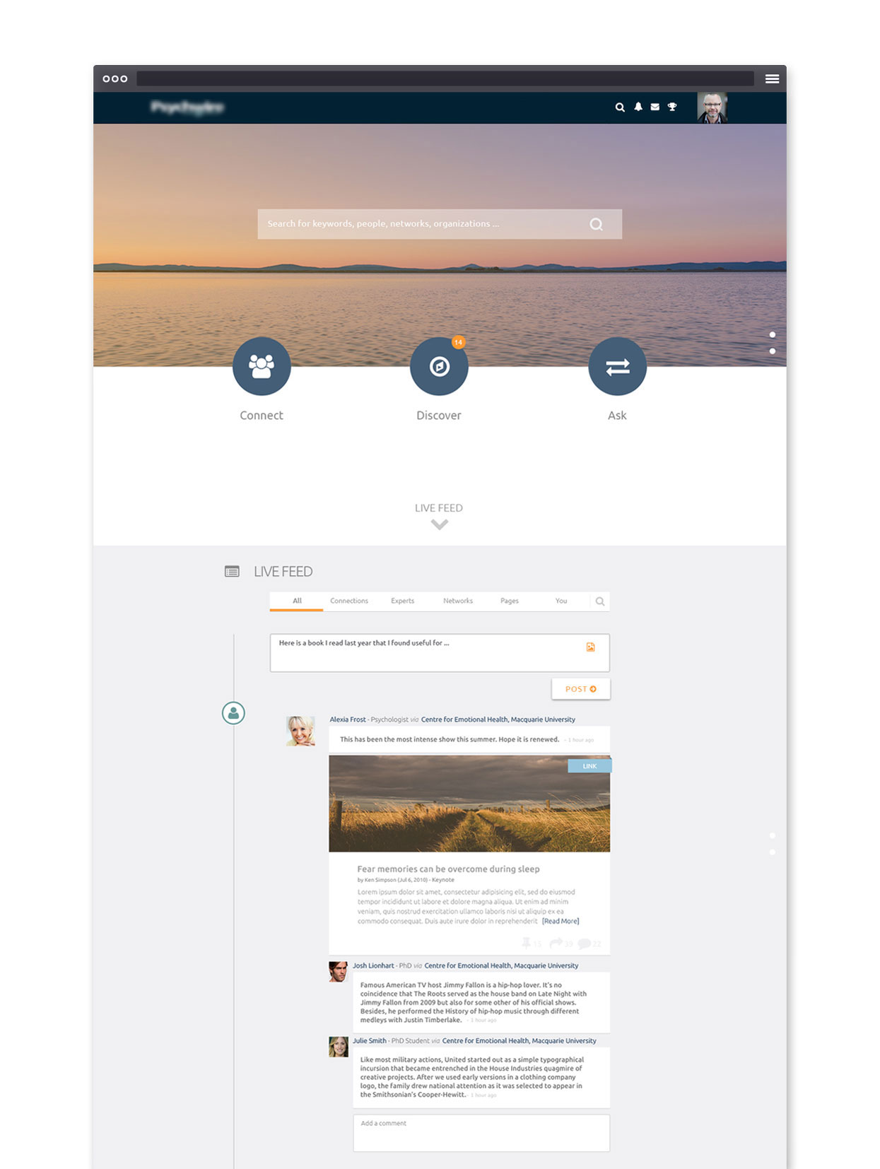
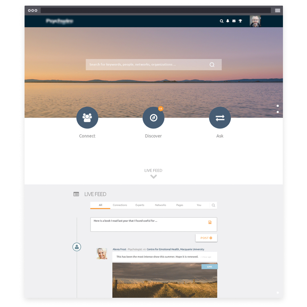
Homepage with news feed


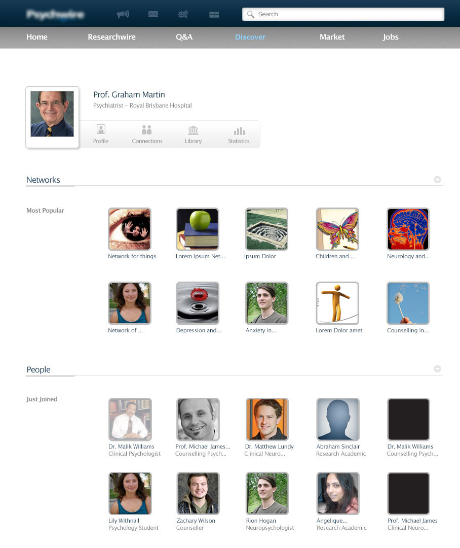
Different sections of the redesigned website: Contacts, Library, Event Feed, Events Directory
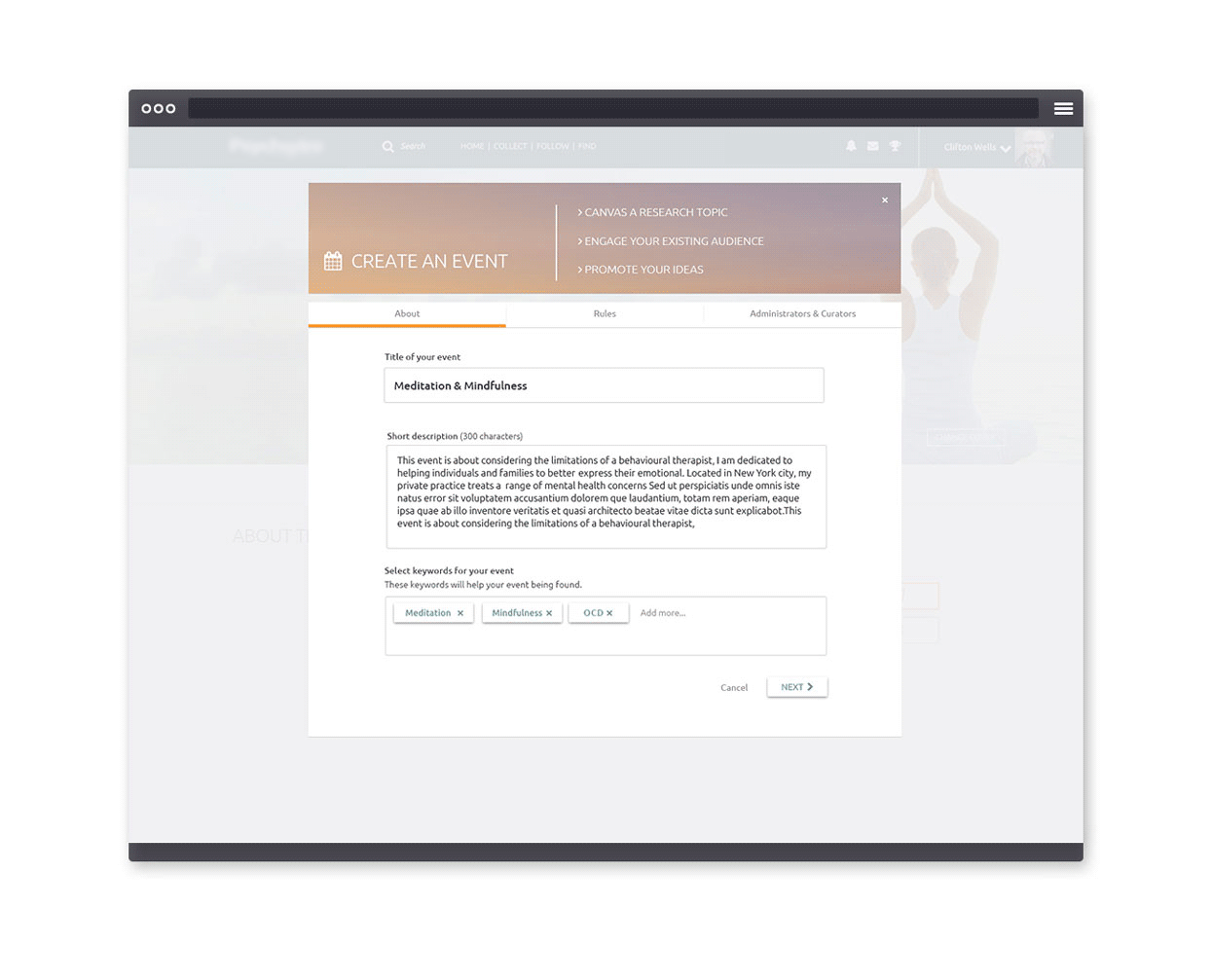
Event creation process
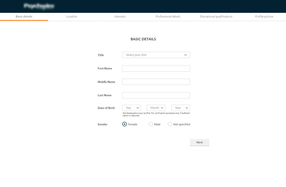

Sign up process

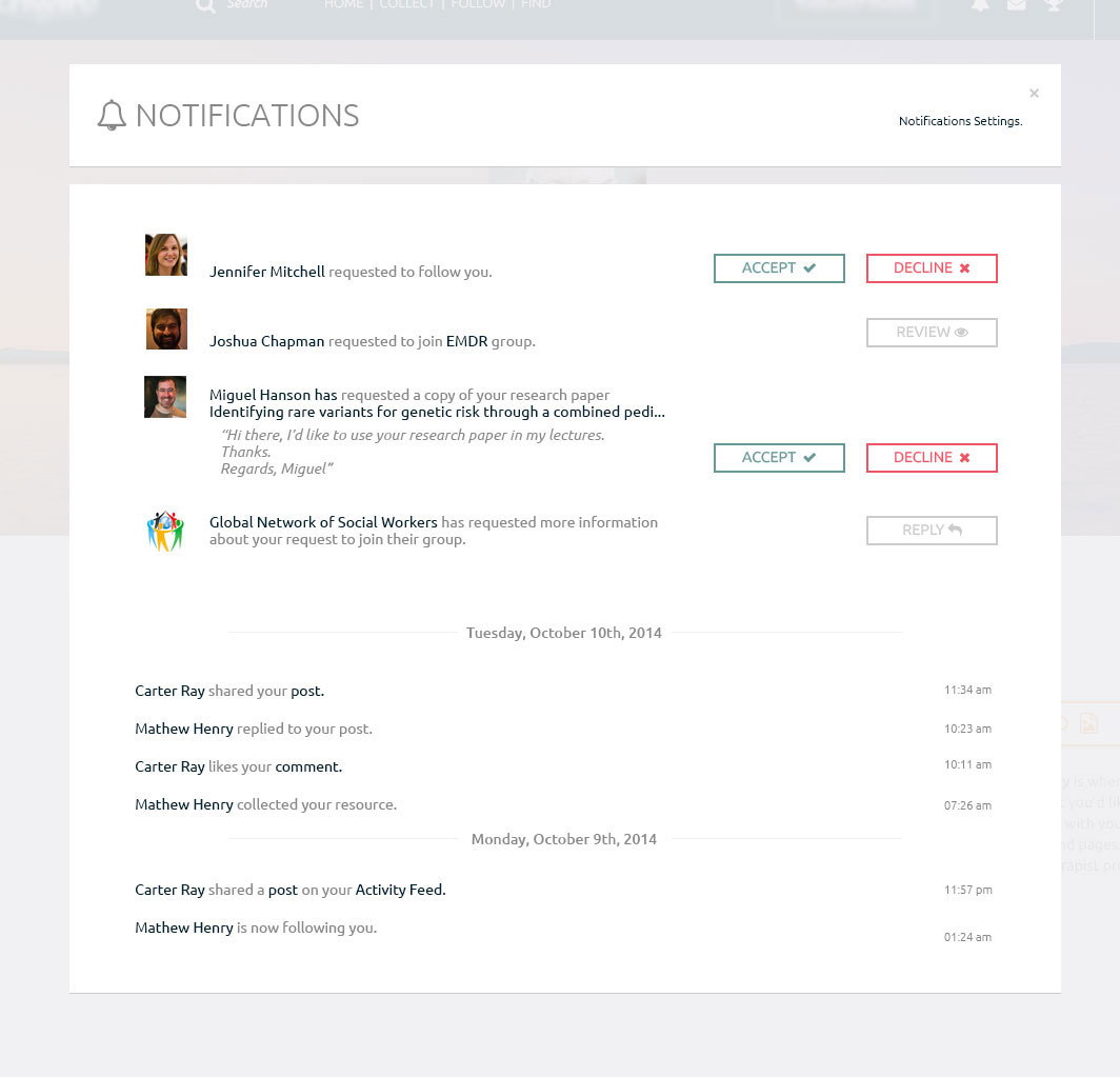
Notification System
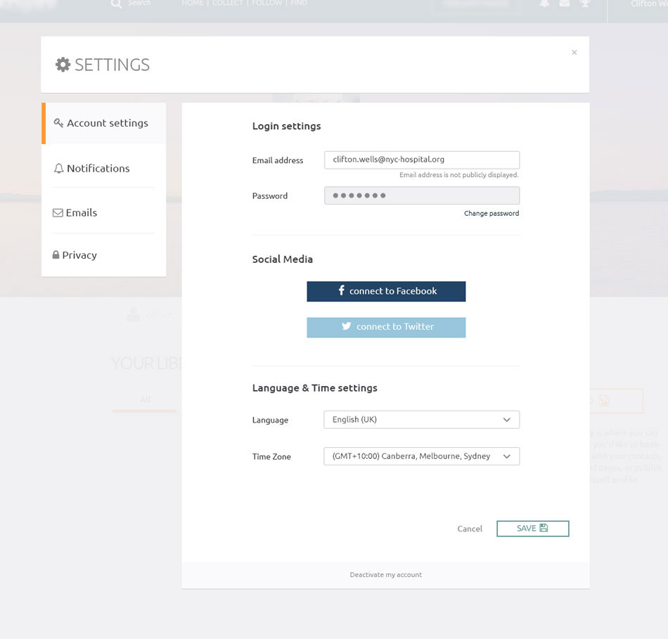
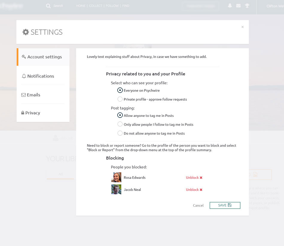
Settings

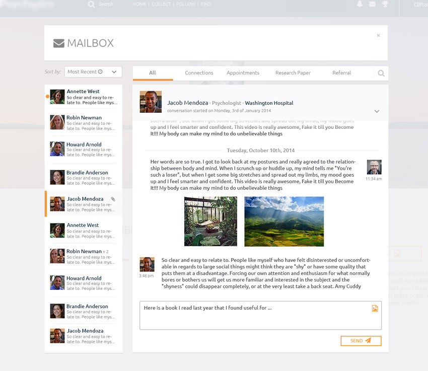
Message & Mailbox
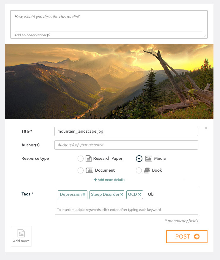

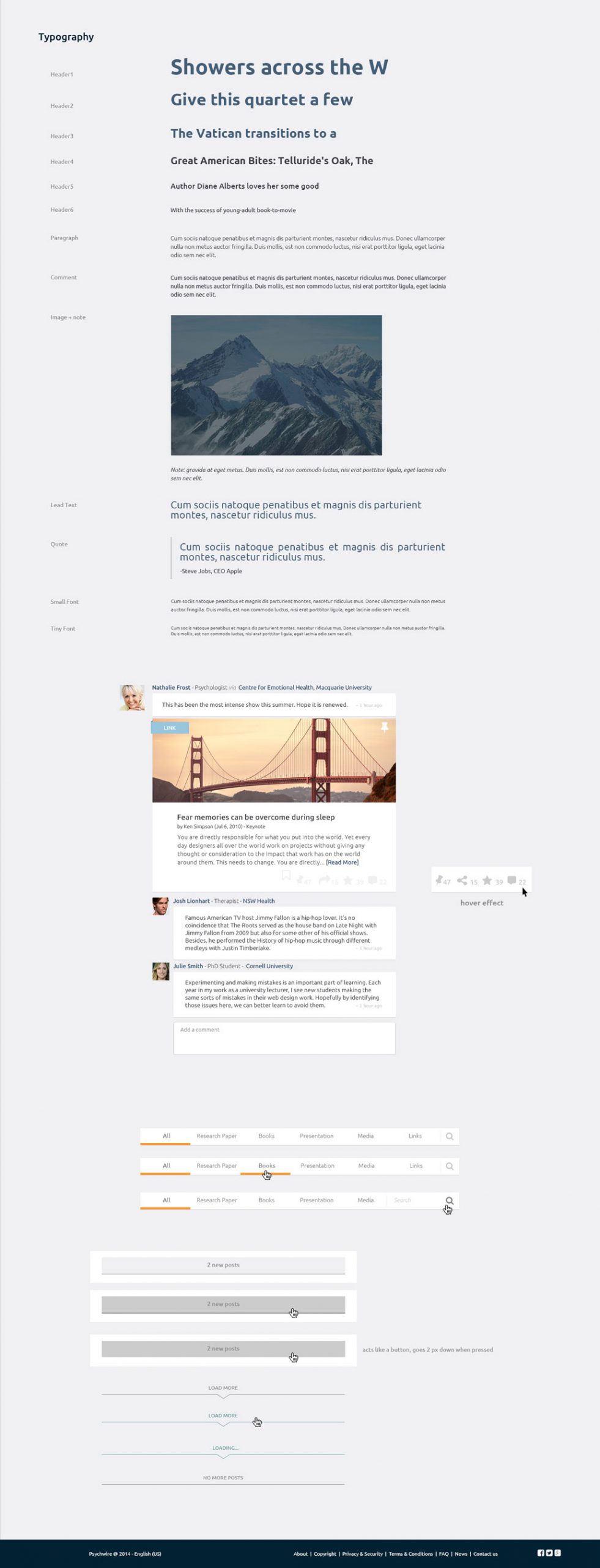
Sharing resources on the LiveFeed

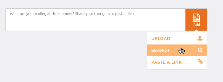
LiveFeed & Posting Content

LiveFeed post & Resource page

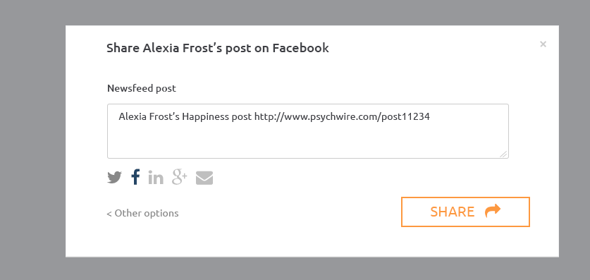
Sign up screen & Share post to Facebook
The Future
Years of work with a really incredible team led us to an online social media platform that was attracting a growing network of users. We had developed an incredibly intuitive and progressive design that was in many ways ahead of its time. For now, however, the site appears to be dormant, so whilst I’m interested to see what the future holds for this company, I’m glad to have left when I did and to have learnt and achieved so much with this team.
“It is not enough that we build products that function, that are understandable and usable, we also need to build products that bring joy and excitement, pleasure and fun, and, yes, beauty to people’s lives.”
– Don Norman